How Speed and Mobile Experience Work Together in Ecommerce
 WpAppBuilder
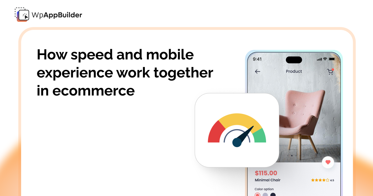
Speed and mobile experience are often discussed as two separate things. One falls under performance, the other under design. In reality, they’re tightly connected. You can’t improve one without affecting the other.
These days, in ecommerce, people usually meet your brand for the first time on their phones. That first moment matters a lot. If your store loads slowly, scrolls slowly, or makes checkout an issue, people just move on. No one’s going to stick around if things feel slow or awkward.
Over the years, we’ve seen a clear pattern across Shopify stores: when speed and mobile experience are treated as one combined priority, conversions improve naturally. When they’re treated in isolation, problems tend to resurface.
Check out: How to Improve Customer Retention by Customer Feedback | Proven Tips Inside
Mobile Is the Primary Channel Now
Mobile traffic didn’t quietly overtake desktop. It did it decisively.
For many Shopify stores, mobile now accounts for more than half of total visits. In some categories, it’s much higher. That means your store isn’t just being viewed on mobile, it’s being judged there.
Customers don’t compare your store to other Shopify stores. They compare it to the apps and platforms they use every day. Social media, messaging apps, and streaming platforms all load instantly and feel smooth.
That expectation carries over to ecommerce.
Why Speed Feels Slower on Mobile
A store that feels “okay” on desktop can feel painfully slow on mobile. There are a few reasons for this:
- Mobile networks aren’t always stable
- Devices have less processing power
- Heavy themes load more noticeably
- Too many scripts compete for attention
When a page takes even a second longer than expected, customers notice. Not consciously, but emotionally. The store feels unreliable.
Speed isn’t just a metric. It’s part of how users feel while browsing.
Speed Shapes the Mobile Experience
Mobile experience isn’t just layout and button size. It’s the entire flow.
A fast store feels:
- Responsive
- Smooth
- Predictable
A slow store feels:
- Confusing
- Broken
- Untrustworthy
When pages load quickly, customers are more likely to scroll, tap, and explore. When they hesitate, every extra second creates friction.
This is why performance improvements often lead to better engagement even without design changes. To improve your store’s speed, you can use apps like Speedboostr.
Why Browser-Based Mobile Stores Hit a Ceiling
Even with a well-optimized theme, browser-based mobile stores have limits.
Mobile browsers:
- Reload pages frequently
- Don’t retain context well
- Can struggle with complex scripts
- Compete with background apps
This is one reason many growing brands eventually explore mobile apps. Not because their website is “bad,” but because apps offer a more controlled environment.
Apps load faster, keep users logged in, and allow smoother navigation, especially for repeat customers.
Where Mobile Apps Change the Equation
A dedicated mobile app doesn’t replace your store. It complements it.
Apps:
- Cache content locally
- Load screens instead of full pages
- Reduce reliance on network speed
- Create consistent performance
The result is an experience that feels fast even on slower connections.
In this case, you can use Mobile App Builder. Rather than starting from zero, merchants can just turn their Shopify store into a mobile app, with no need for complicated coding. Everything stays connected, from products to collections to checkout. The big difference? Customers get that smooth, fast app experience.
Speed Is What Makes Mobile Retention Possible
Getting users to install an app is one thing. Keeping them engaged is another.
Speed plays a big role in retention:
- Faster app launches reduce drop-offs
- Smooth navigation increases browsing time
- Instant access encourages repeat visits
When customers know an app “just works,” they come back without hesitation. This is especially important for stores with repeat purchases or frequent promotions.
Design Alone Can’t Fix Performance
A clean mobile design won’t save a slow experience.
We’ve seen stores with beautiful layouts struggle because:
- Too many scripts block loading
- Images aren’t optimized
- Animations delay interaction
Performance needs to be part of the design conversation from the beginning. Speed decisions affect how designs behave in the real world, especially on mobile devices.
How to Think About Speed and Mobile Together
Instead of asking:
“Is our store fast?”
or
“Does our mobile design look good?”
Ask:
“How quickly can a mobile customer move from intent to checkout?”
That shift in thinking changes priorities.
It leads to:
- Fewer distractions
- Cleaner flows
- Faster interactions
- Better outcomes
Whether through performance optimization or mobile apps, the goal stays the same: remove friction.
Why This Matters More in 2025
Customer patience continues to shrink. At the same time, competition keeps increasing.
Small performance gaps are no longer small. They compound across ads, organic traffic, and repeat visits.
Stores that invest in speed and mobile experience together are better positioned to:
- Convert first-time visitors
- Retain repeat customers
Final Thoughts
Speed and mobile experience aren’t separate checkboxes. They’re two sides of the same experience.
A fast store enhances mobile usability, and a strong mobile experience amplifies the value of speed.
When both are handled together, whether through optimization or dedicated mobile apps, ecommerce stores stop feeling fragile and start feeling reliable.
That reliability is what customers remember.
And in a world where attention is limited, being remembered for the right reasons is what drives growth.
Related blogs


